PROJECT OVERVIEW
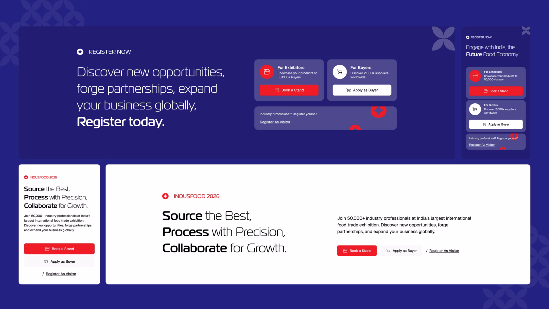
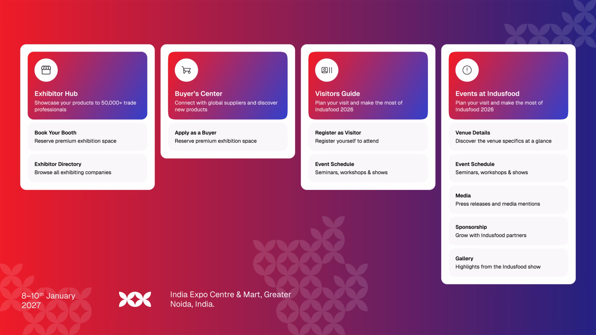
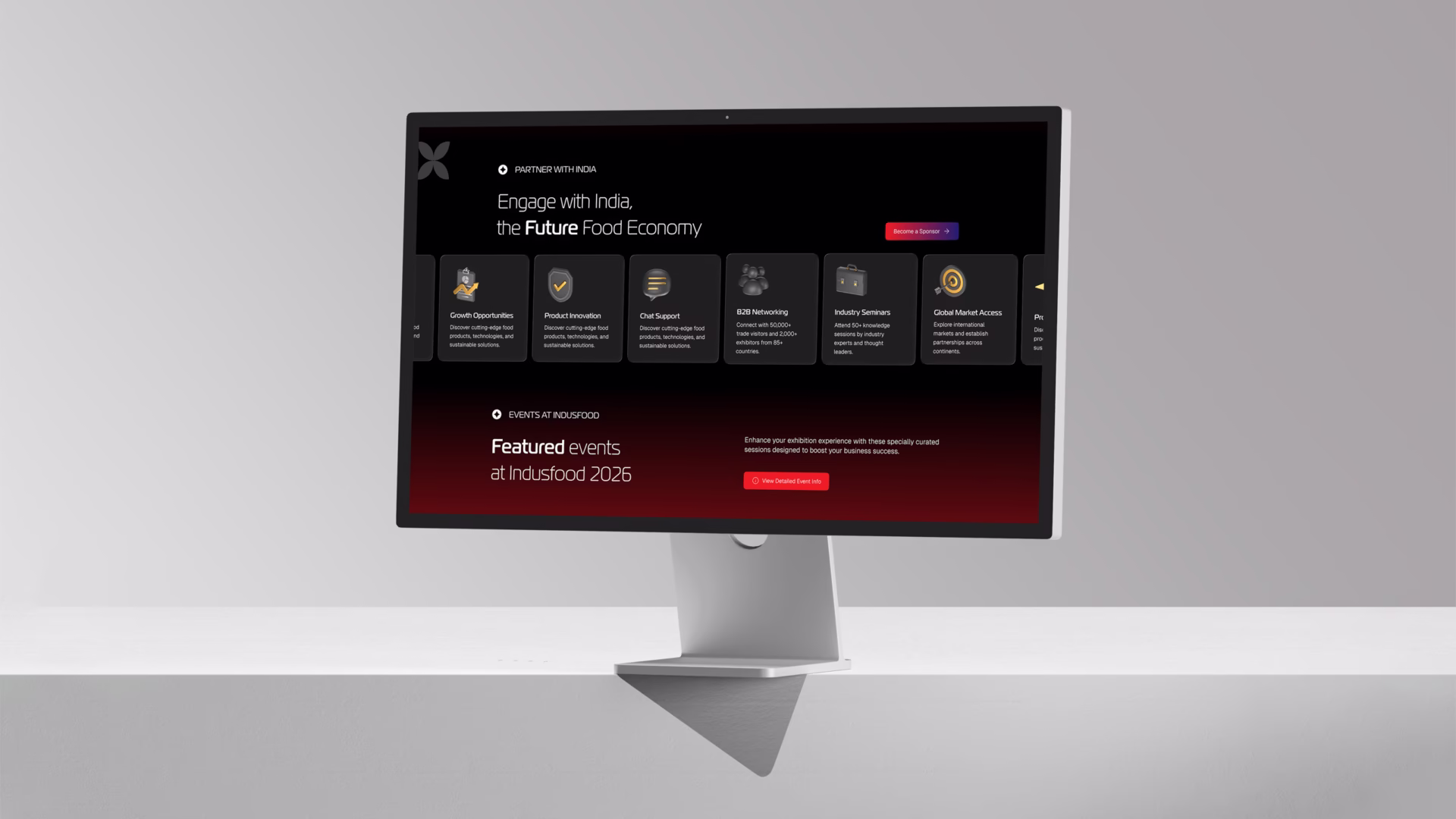
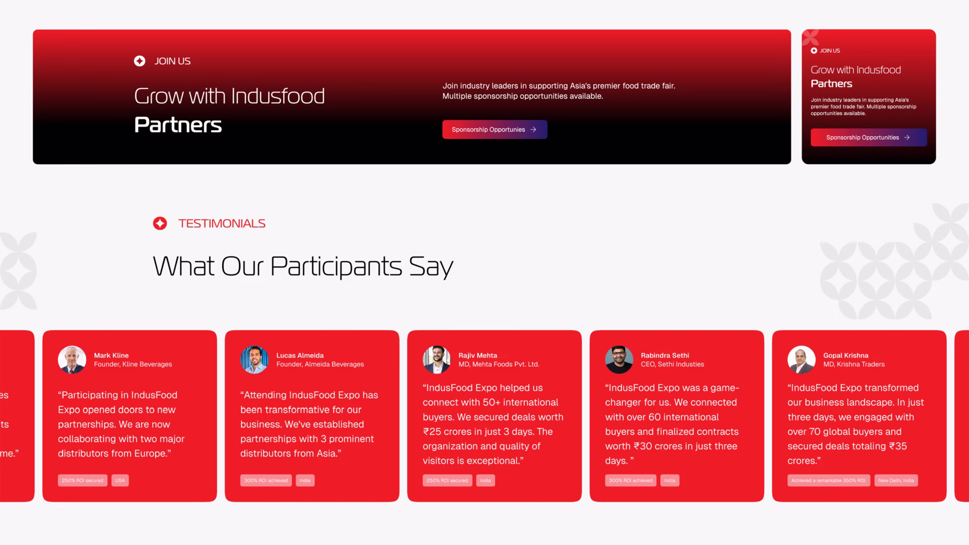
The redesign of the Indus Food website was built to create a seamless digital experience for one of the industry’s largest global trade platforms. Beyond presenting large volumes of content, the platform needed to support distinct user journeys for Exhibitors, Buyers, and Visitors, each requiring a carefully structured flow of information tailored to their objectives.
The website architecture was also required to work in harmony with ERP-integrated systems, ensuring that registrations, exhibitor data, business matchmaking, and event-related information could be managed efficiently across connected digital ecosystems. Balancing usability with technical complexity, the platform was designed to deliver a clear, intuitive experience while supporting the operational demands of a large-scale international trade event.
PROBLEM STATEMENT
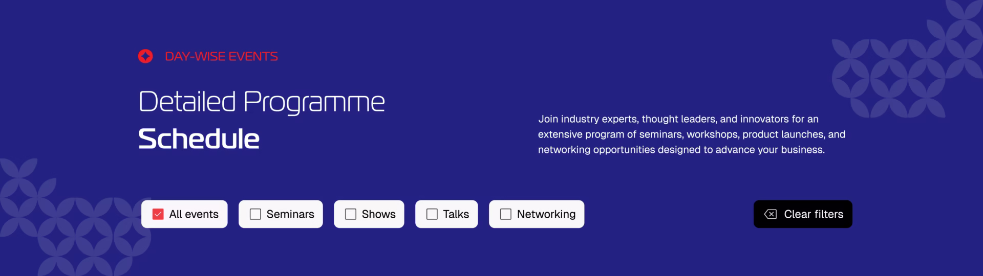
The existing website struggled from a user experience standpoint. The navigation menu was cluttered, the information architecture lacked clarity, and users were not being guided through the website in a structured way. There was little sense of continuity or “looping” in the navigation, making it difficult for visitors to move naturally between sections. Given the scale of content that needed to be presented, the challenge was to simplify the experience without compromising depth or accessibility.
OUR APPROACH
We began with a detailed audit of the existing website to identify pain points in navigation, usability, and overall user flow. Before entering the design phase, we developed a comprehensive sitemap to establish a clean and robust information architecture, ensuring the foundation of the website was solid and scalable.
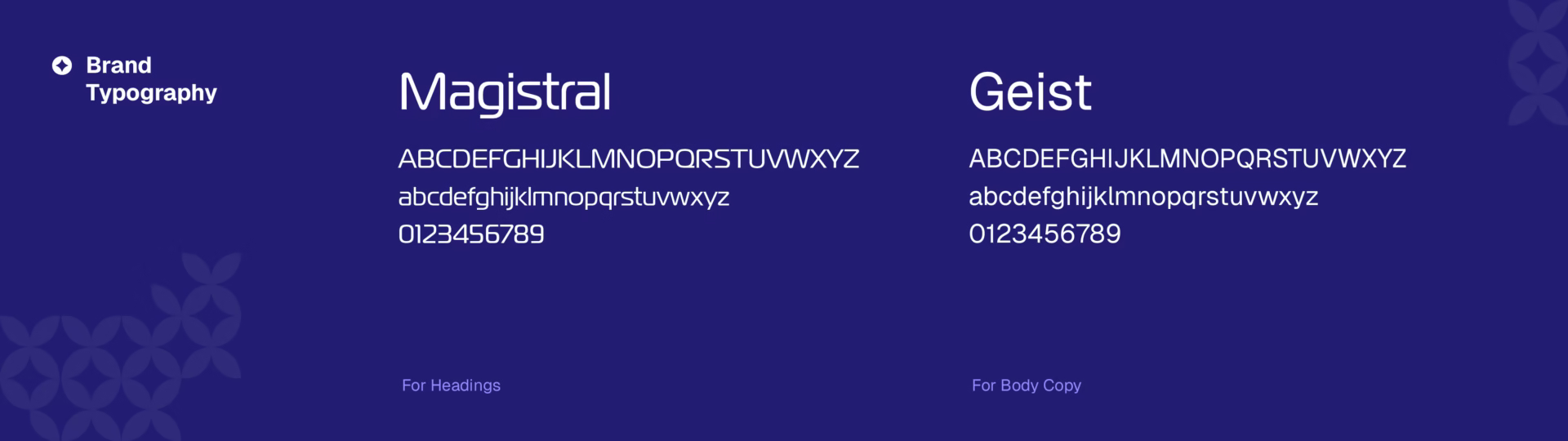
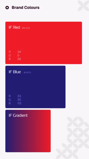
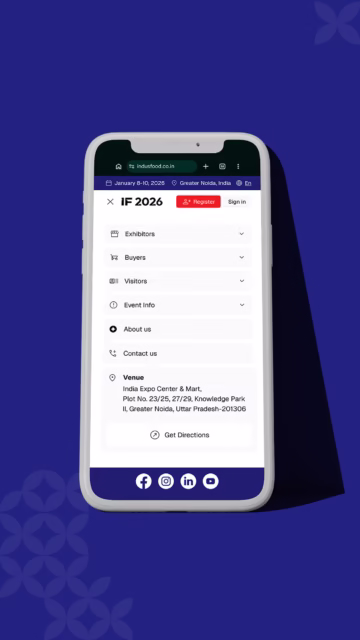
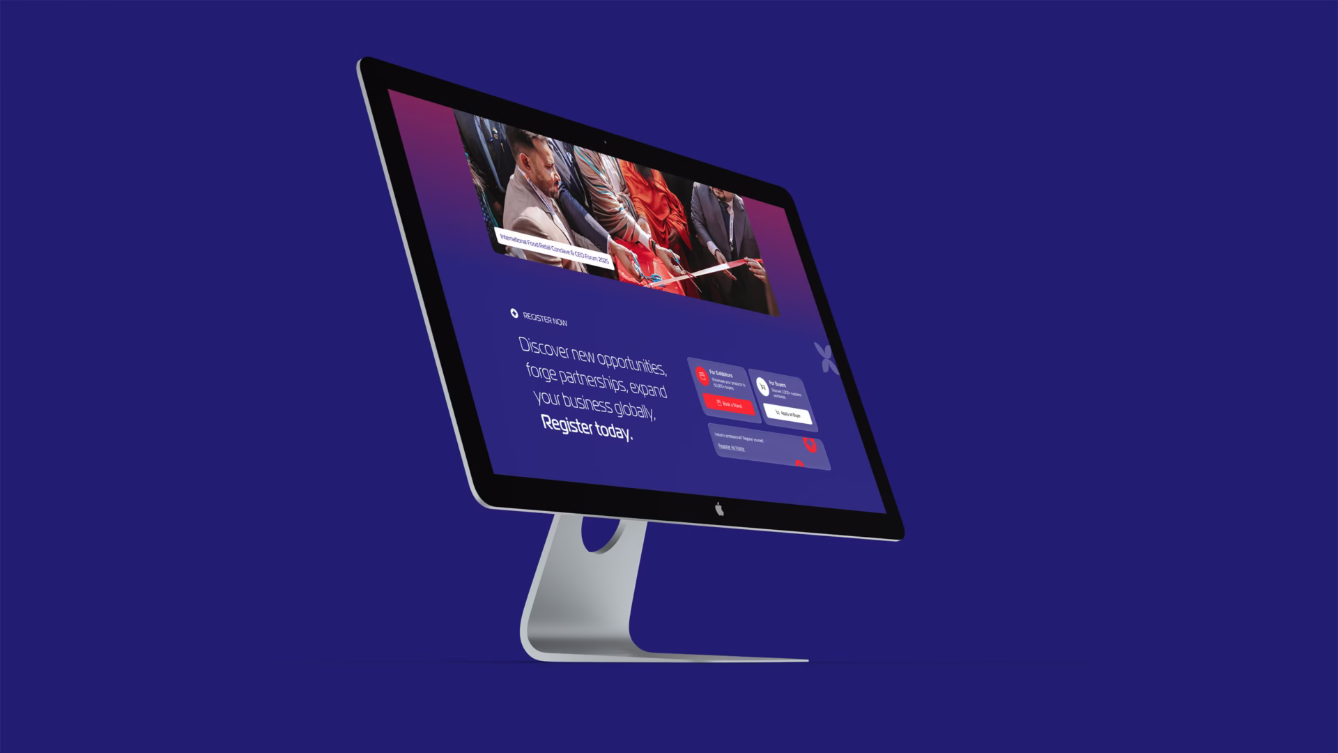
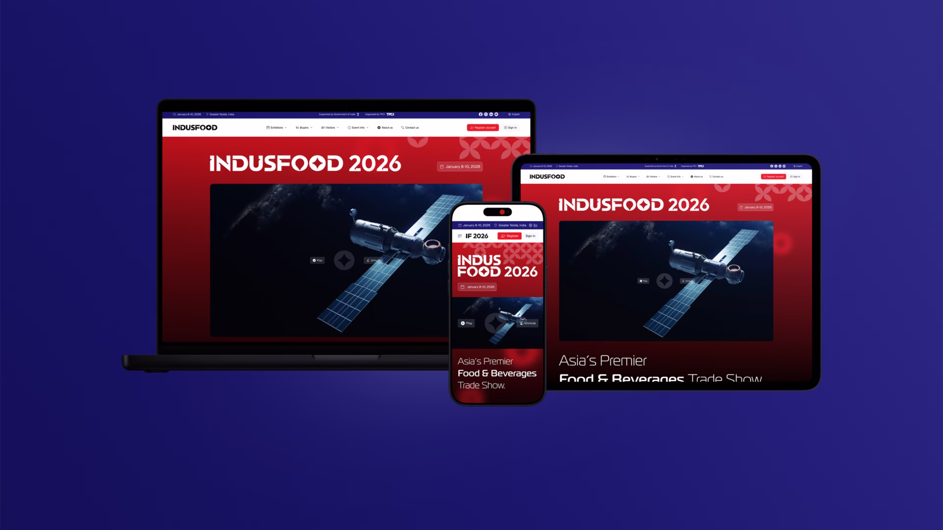
Because we had previously created the Indus Food branding and identity, we were able to maintain complete aesthetic consistency while refining the digital experience with greater creative freedom. We also worked closely with the development team throughout the process to ensure that motion, interactions, responsiveness, and implementation details were thoughtfully executed across devices.
The final website was designed with one core objective: to make a content-heavy platform feel effortless to use, helping visitors find information quickly while creating a smooth and engaging navigation experience.