Revolutionizing Ayurvedic Beauty: MuktiGold's Rebranding

Revolutionizing Ayurvedic Beauty: MuktiGold's Rebranding

SCOPE

Brand Consulting, Branding & Packaging Design

INDUSTRY

Health & Wellness & FMCG


CLIENT NAME

MuktiGold

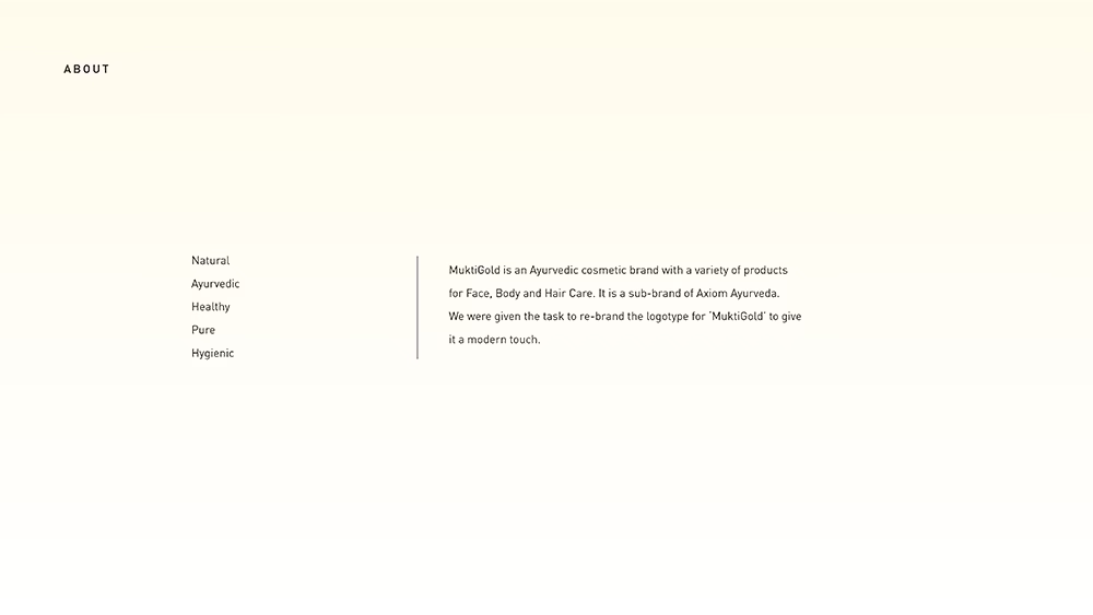
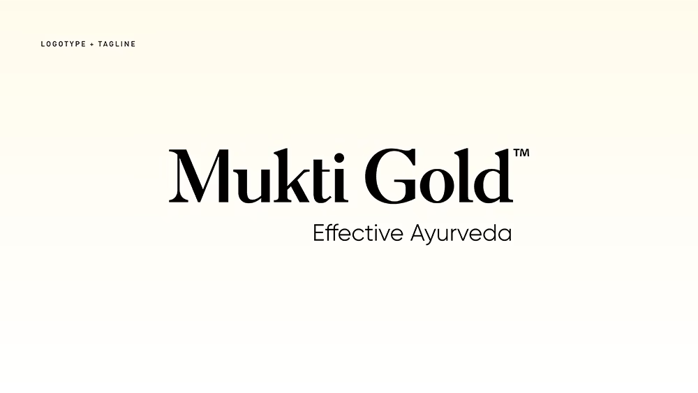
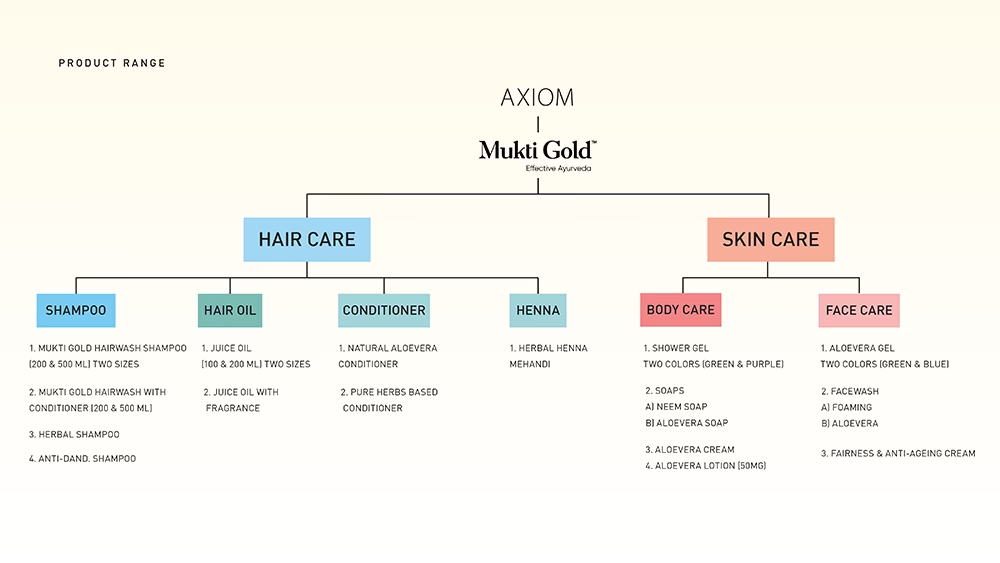
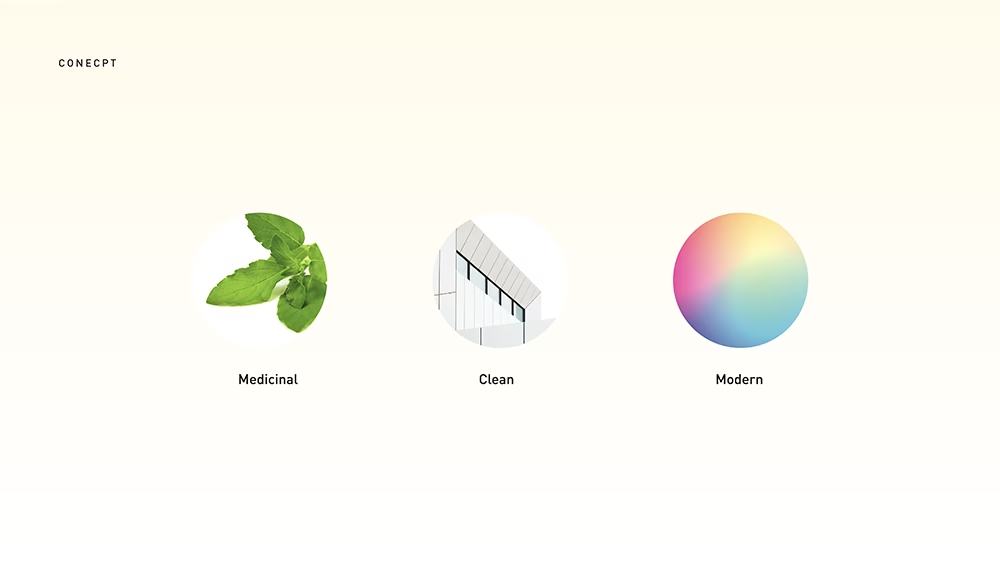
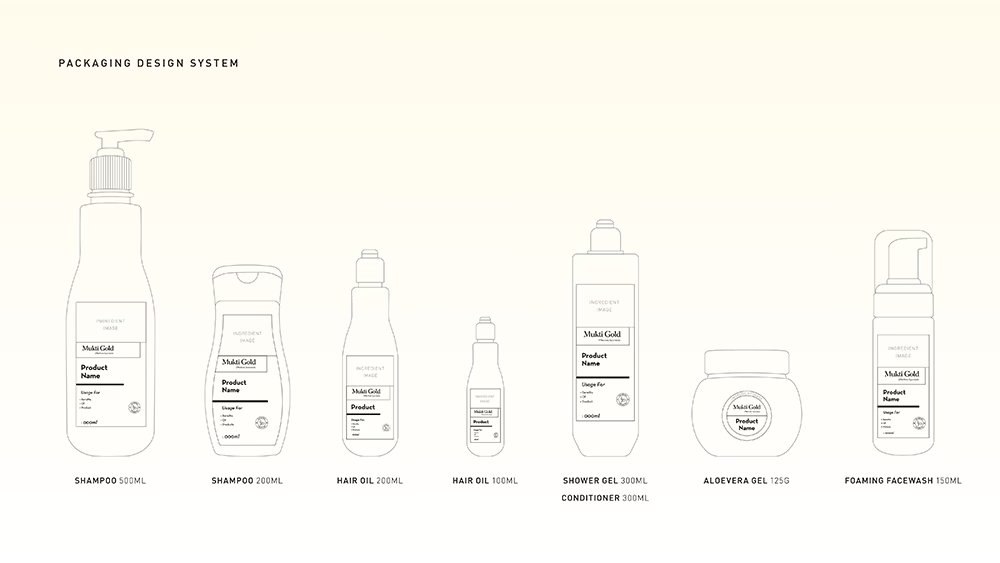
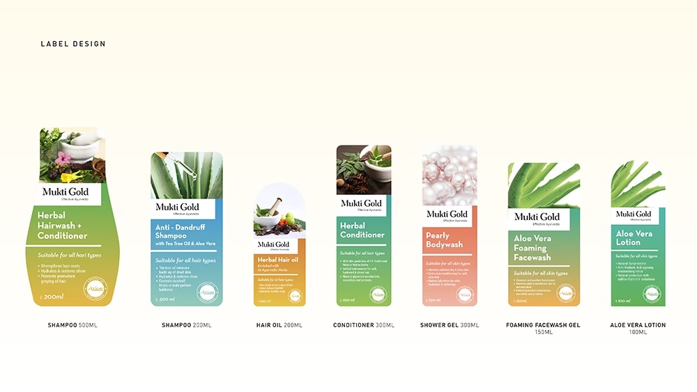
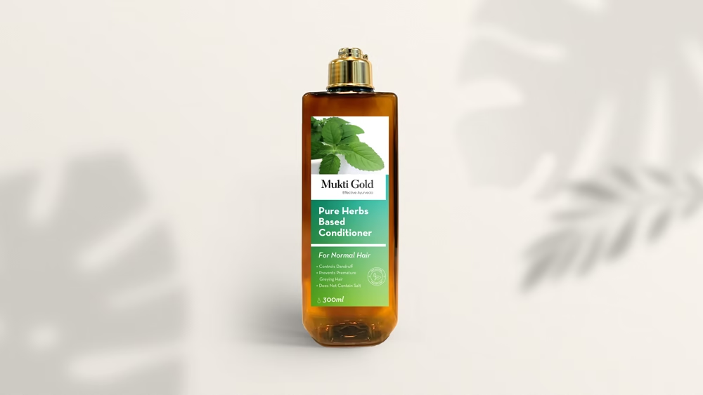
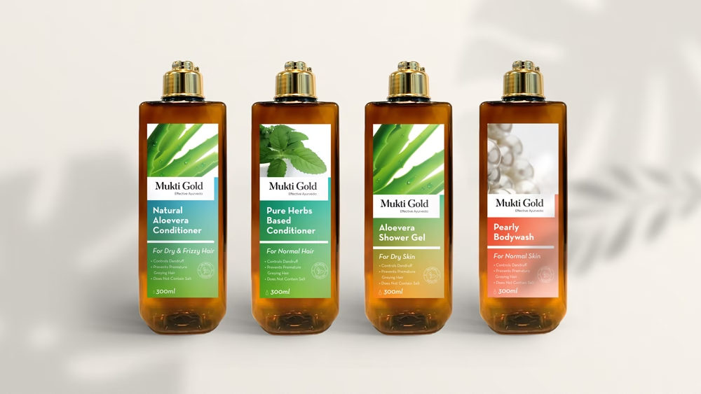
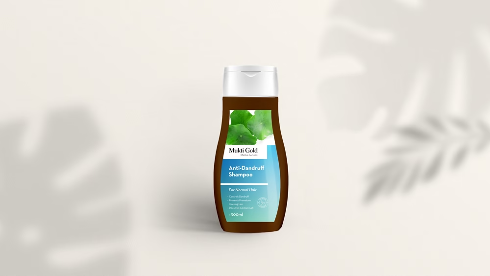
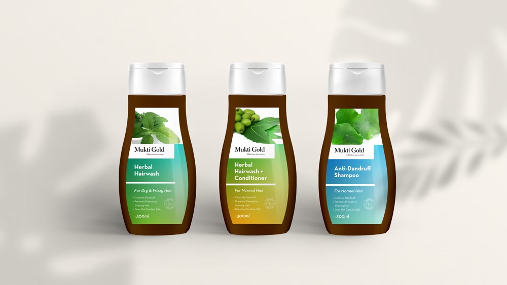
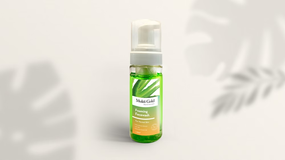
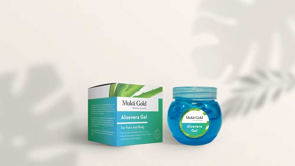
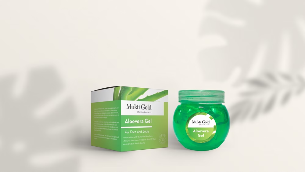
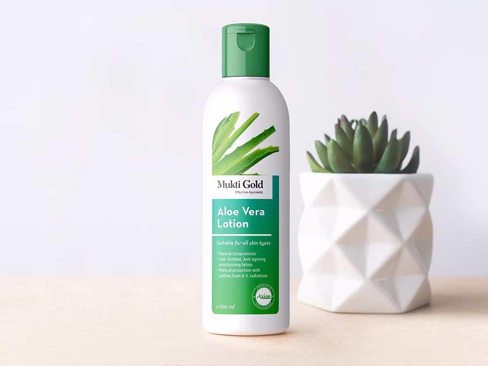
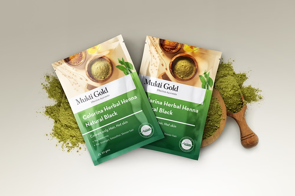
MuktiGold, an Ayurvedic brand under Axiom Ayurveda, underwent a modern rebranding focusing on a sleek packaging design system. Gradients symbolizing ingredients were employed, complemented by clear imagery for easy recognition. This scalable system offers flexibility for future product additions while ensuring a contemporary appeal from afar.

CLOSE OVERLAY
MuktiGold

Revolutionizing Ayurvedic Beauty: MuktiGold's Rebranding

SCOPE

Brand Consulting, Branding & Packaging Design

INDUSTRY

Health & Wellness & FMCG

Revolutionizing Ayurvedic Beauty: MuktiGold's Rebranding

SCOPE

Brand Consulting, Branding & Packaging Design

INDUSTRY

Health & Wellness & FMCG

Project Overview

MuktiGold, a renowned Ayurvedic cosmetic brand under Axiom Ayurveda, sought a rebranding initiative to transition from its conventional image to a modern aesthetic. The project aimed to devise a cohesive packaging design system encompassing a diverse range of skincare and haircare products. The objective was to infuse a contemporary appeal while maintaining the essence of Ayurveda and highlighting the natural ingredients integral to MuktiGold’s formulations.

Problem Statement

The challenge lay in revitalizing MuktiGold’s visual identity to resonate with modern consumers while preserving its heritage as an Ayurvedic brand. The existing packaging lacked visual appeal and failed to effectively communicate the essence of the products, hindering consumer engagement and brand recognition. Additionally, the absence of a unified design system posed obstacles in expanding the product line and maintaining consistency across various offerings.

Our Approach

We conducted thorough market research and analysis to understand consumer preferences and shelf visibility. Leveraging gradients as the main visual element, each product variant was assigned a distinct color scheme representing Ayurvedic ingredients. Flexible label layouts facilitate scalability and easy integration of new products, ensuring a modern yet cohesive brand identity.