Project Overview
The project endeavors to craft a comprehensive branding and communication strategy for Pancha-Amrit, an Ayurvedic supplement company poised to revolutionize the market by integrating the principles of nature and science into its offerings. Pancha-Amrit seeks to transcend conventional representations of Ayurveda by embodying the essence of ‘Amrit’ – the elixir of life – in its products.
Problem Statement
Pancha-Amrit sought to create a distinct brand identity that transcended conventional representations of nature and Ayurveda. With the goal of communicating the fusion of scientific knowledge and natural wisdom embodied in their products, the challenge was to design a comprehensive branding and communication structure that resonated with diverse customer segments, both domestically (B2C) and in retail environments.
Our Approach
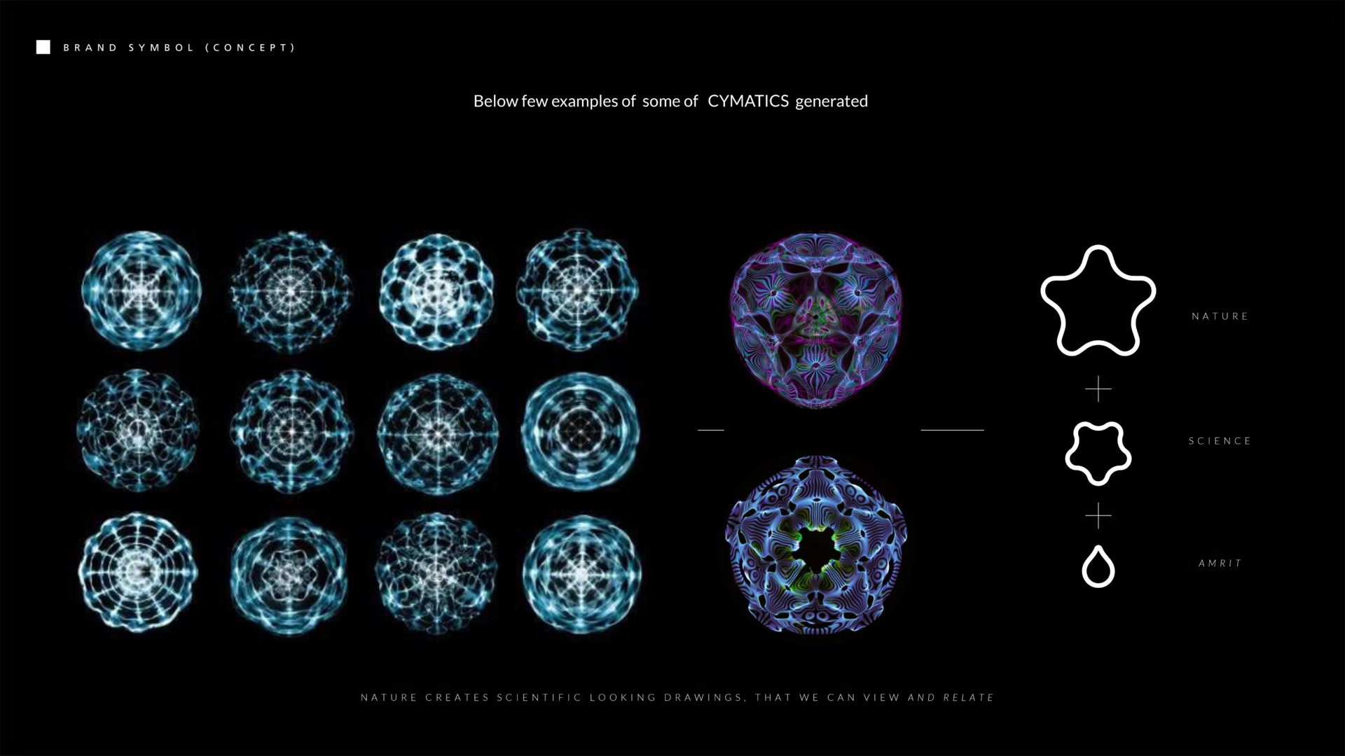
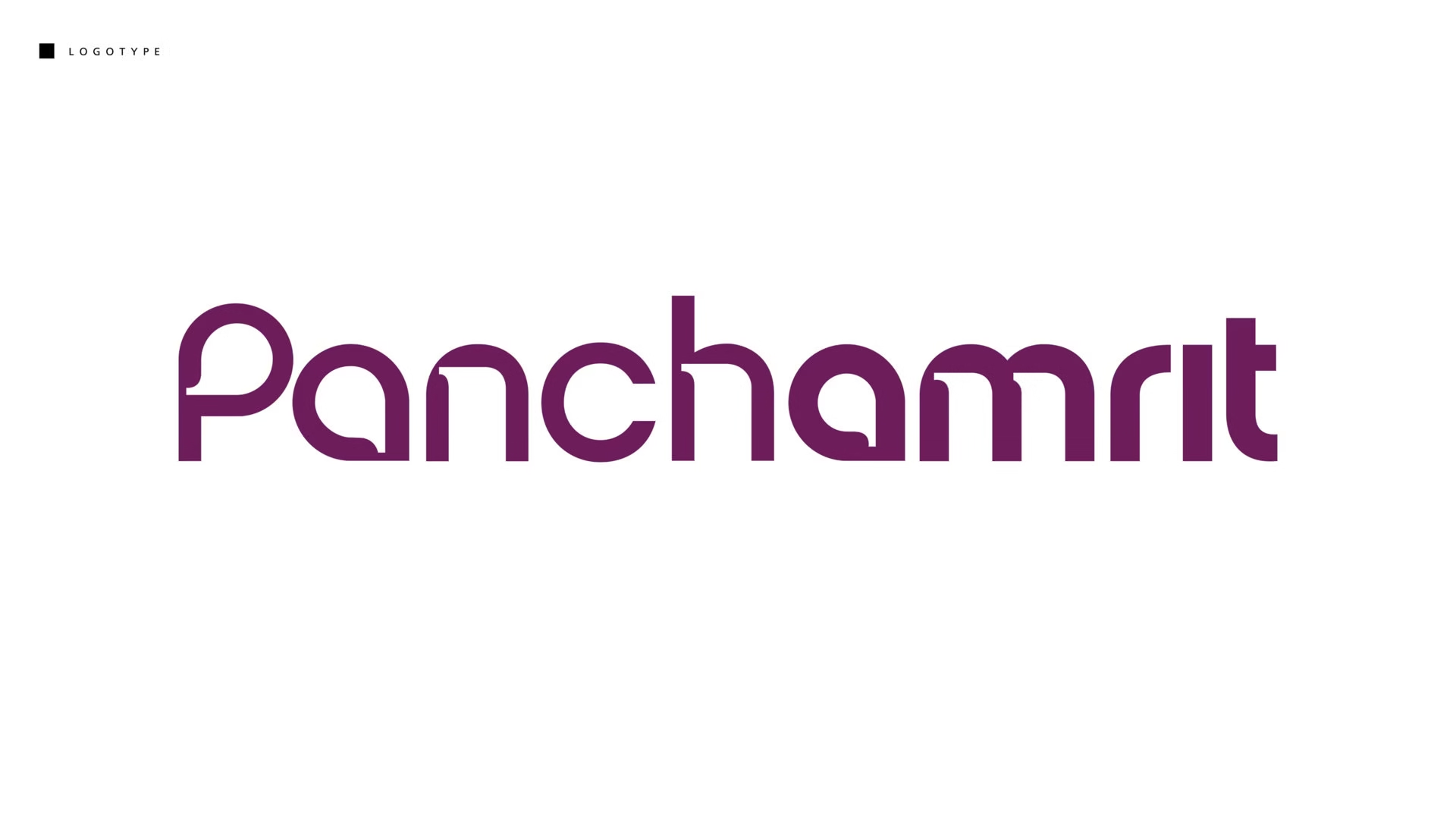
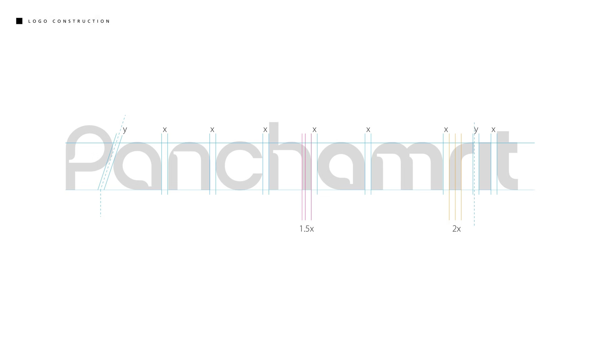
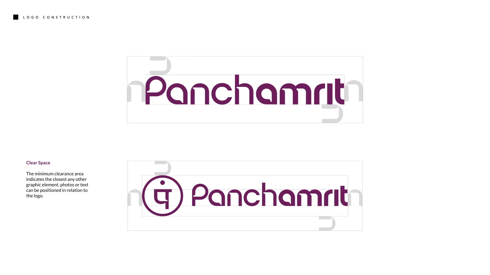
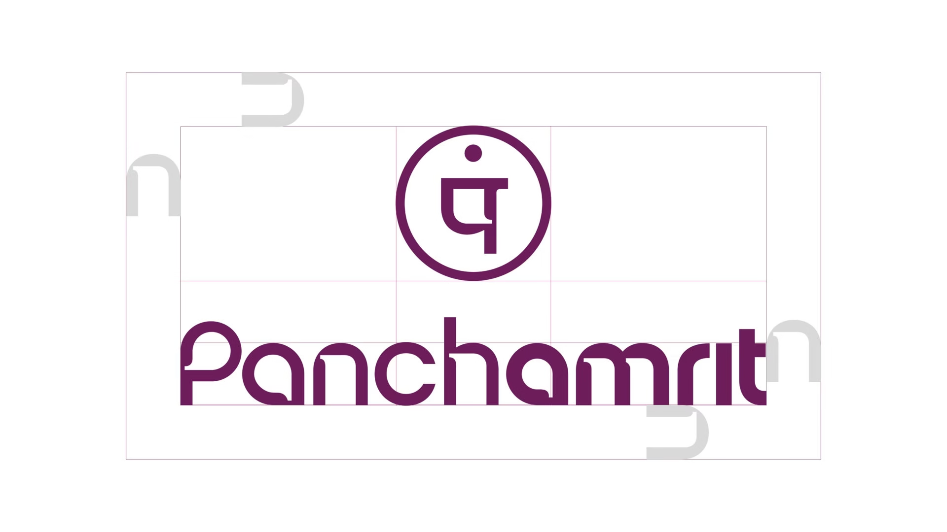
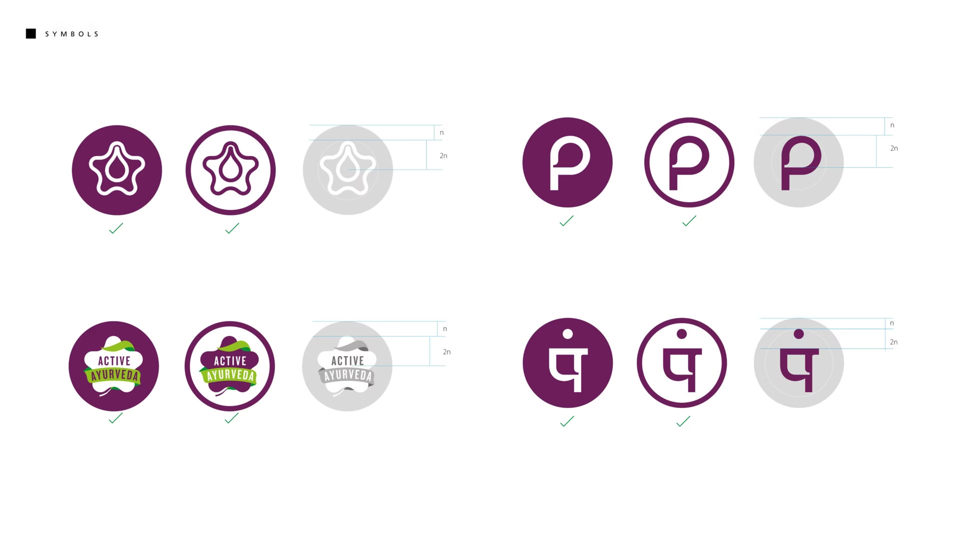
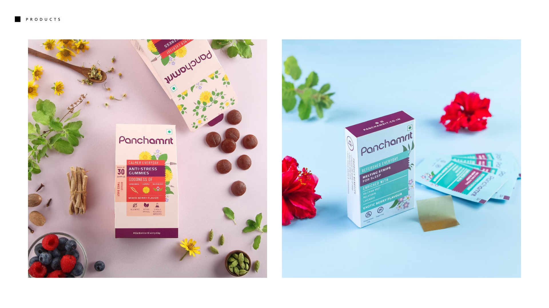
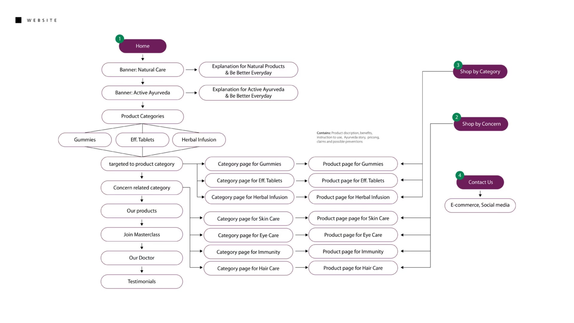
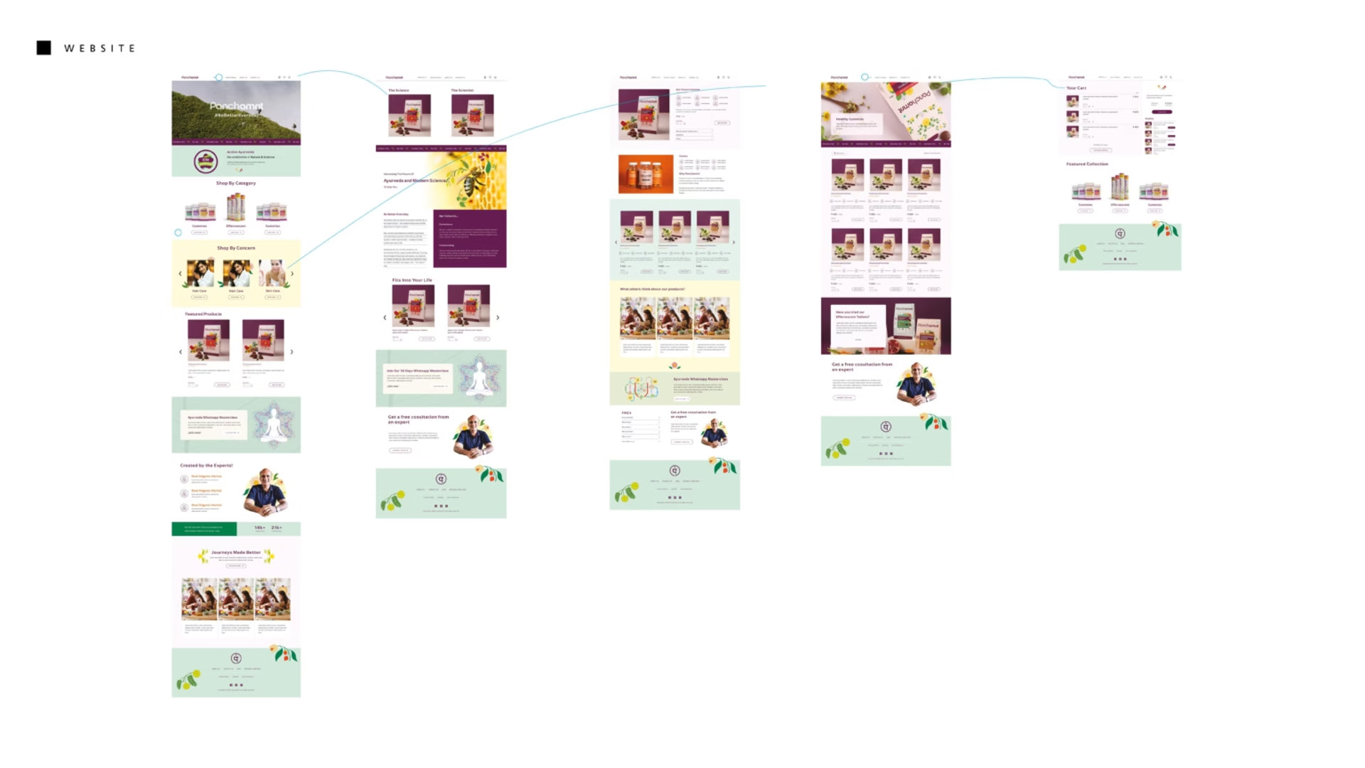
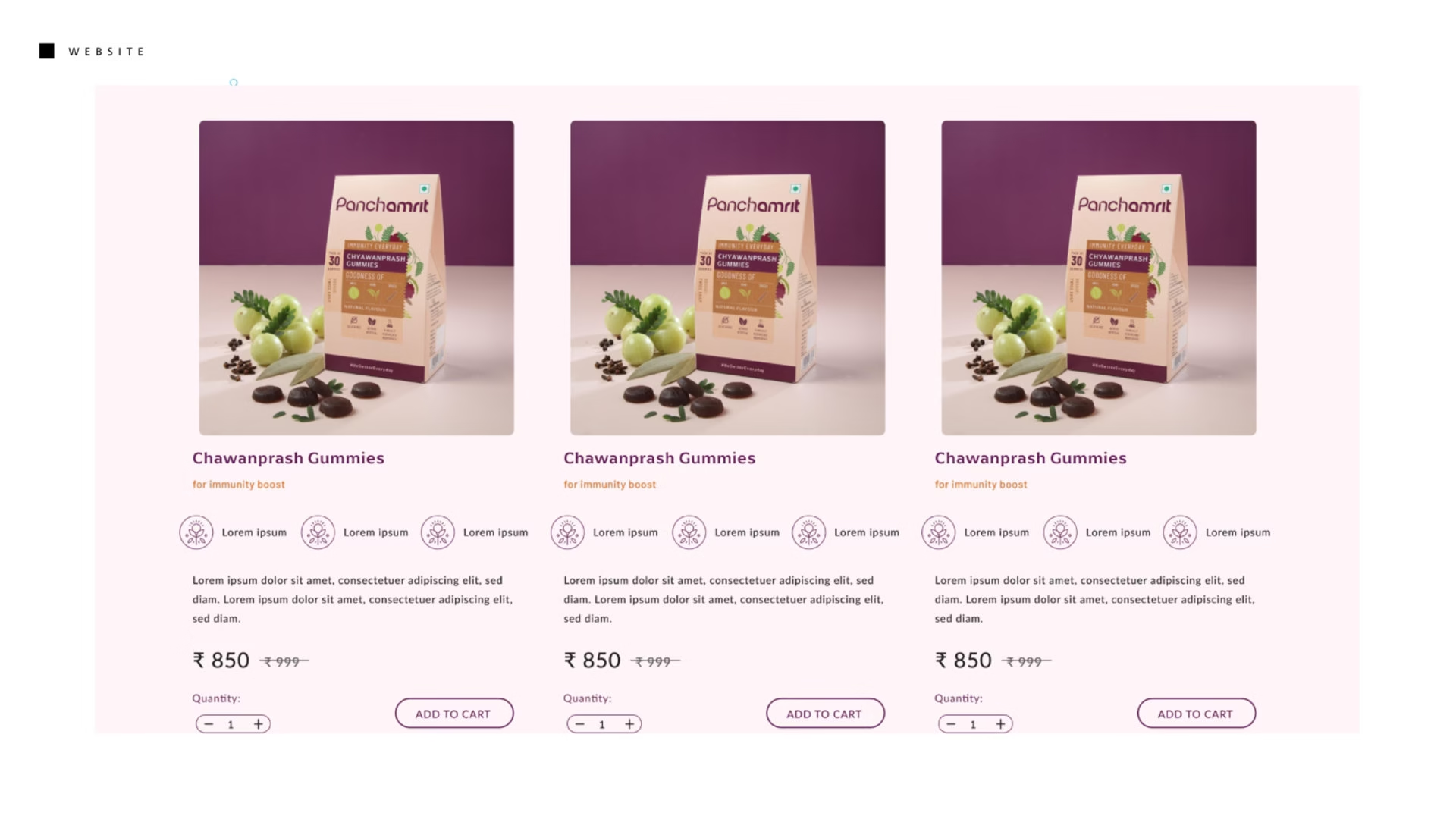
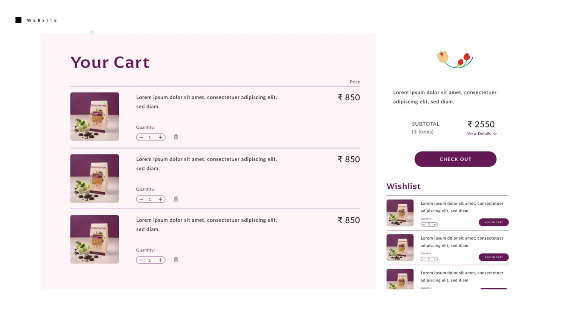
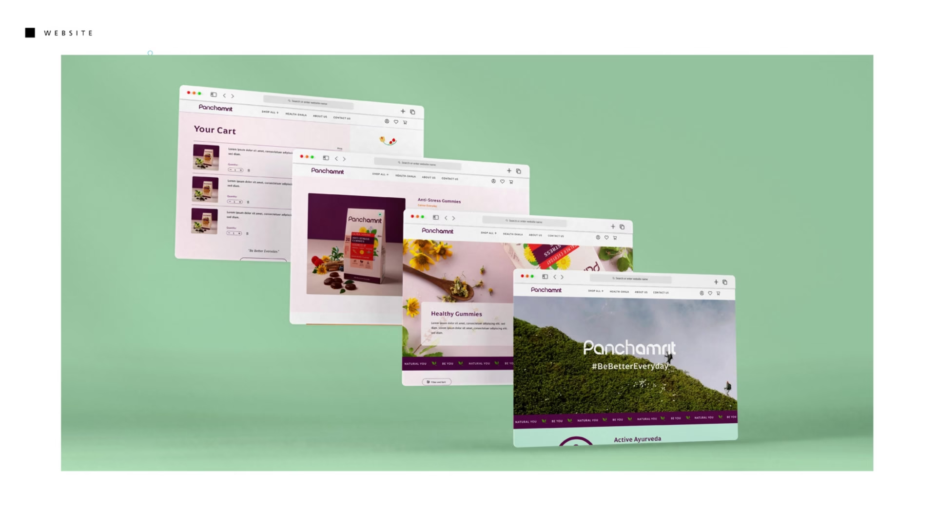
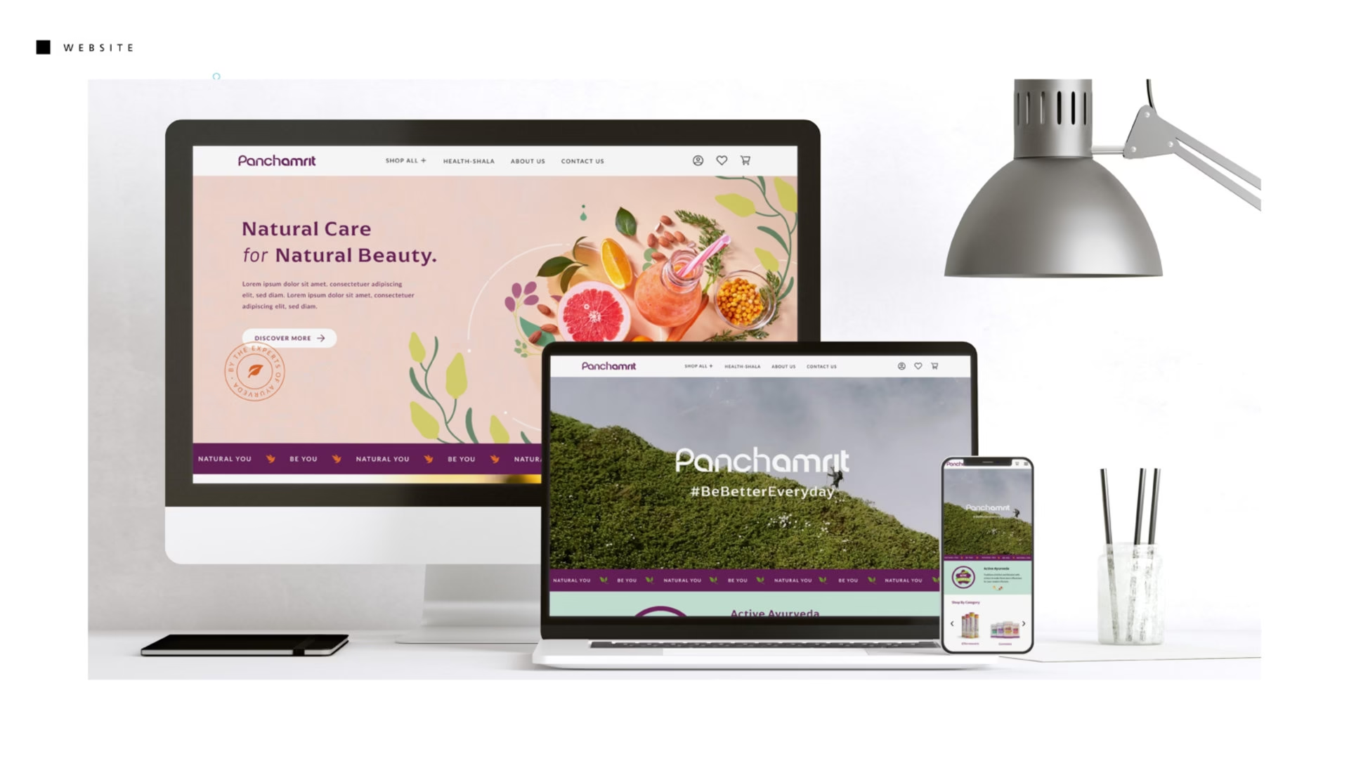
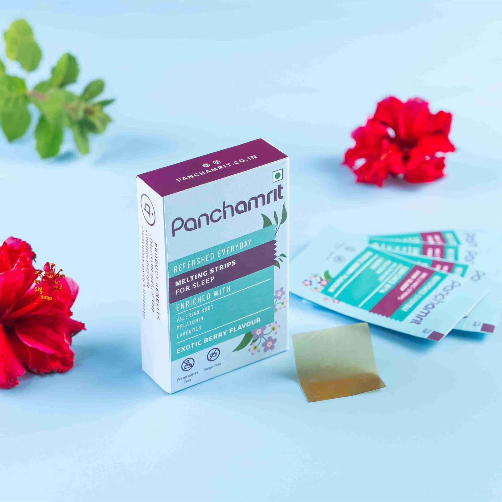
Understanding the significance of branding elements, we prioritized the development of a hand-drawn logotype and incorporated the Hindi letter “p” to bridge cultural divides. With a focus on accessibility, our product lines aim to bring the scientific knowledge of nature to tabletops through teas, herbal infusions, effervescent tablets, gummies, and melting strips. Anticipating the post-COVID market resurgence, we tailored our approach to cater to both D2C and retail channels, emphasizing the importance of packaging visibility and effective messaging across all platforms, including our website, which underwent iterative design processes to ensure seamless retail and D2C experiences.
